Moodboard: Yellow

{aesthetic of joy} is a new series I’m trying out that goes to the heart of what this blog is about. The idea is for each post to zoom in on a specific element (a color, pattern, or shape) and explore how it can be used to create a sense of joy. I’d love to know what you think of this idea.
A few years back, a researcher named Orlagh O’Brien did a study where she asked people to name the colors they associate with different emotions. Joy was overwhelmingly yellow. Yet only 5% of people choose yellow as their favorite color, making it the world’s least-liked hue.
I’ve always found this tension is interesting—how can the most joyful color also be the least-liked?
The reality may have something to do with the way we see yellow. Our eyes contain three light-sensing pigments corresponding to different wavelengths of light. One responds to the long wavelengths in the red range, one to the medium green wavelengths, and one to the short wavelengths that we see as blue. When we see different colors, they excite different pigments to varying degrees. But you’ll notice that even though yellow is considered a “primary” color, there’s no specific pigment activated by it. To see yellow, not one but two pigments need to be activated to nearly their full capacity: yellow occurs when both red and green pigments are highly excited. In addition, the yellow range is located in the brightest part of the visible spectrum, right near the middle. Put these two facts together, and yellow is the lightest and most vibrant color our eyes perceive, apart from pure white.
Yellow is the most attention-getting color, but also the most fatiguing for the eye to look at for long periods of time. Thus yellow mirrors the nature of joy. To be in a state of joy every moment of the day would be exhausting, but to have a few moments of joy punctuating a day feels wonderful. Likewise, a yellow world is too much, but small pops of yellow catch the eye and brighten our mood, so to speak. To choose yellow as a favorite color implies monogamy, and yellow is too intense a color to settle down with. It’s a sometimes-playmate, a cheerful visitor, like a friend from out of town who only visits once a year and always wants to go dancing.
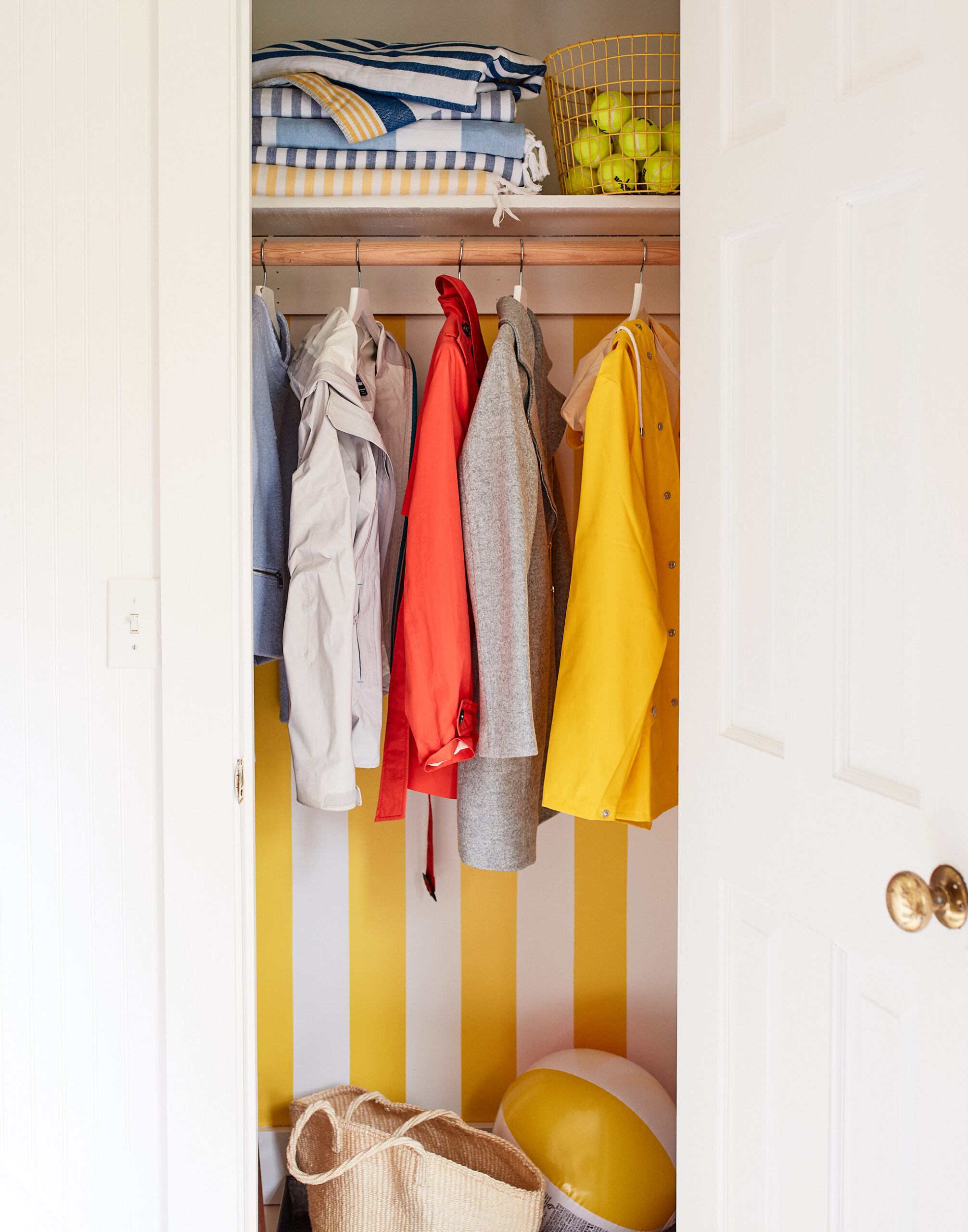
So yellow is best used in pops, like a doorway or a small car, or a jacket. In this way, yellow can be surprising, a beacon to come nearer and check something out. In Dublin a few years ago there was a city-sponsored initiative called the “yellow bench project,” which scattered vivid yellow park benches around the city imprinted with the words: “By sitting on this bench I’m open to conversation with a complete stranger.” The boldness of yellow suggests something different is going to happen, perhaps something unexpected.
Mostly, yellow is the color of moments. But occasionally someone dares to use yellow at scale, as in image 06, below, and the result is awe-inspiring. In 2013, Wolfgang Laib created Pollen from Hazelnut, an installation that filled the atrium at New York’s MoMA. I like this because it feels so unnatural to experience that much vibrancy at once, and yet the source is natural. Scattered, these small grains of pollen are joyful only to bees, but in bringing them together, we are able to comprehend the scale of a joy unnoticed in our midst. So the work is the act of concentration rather than fabrication, revealing the hidden color that surrounds us.
Yellow is too much, and that’s its beauty. There are moments in life that should feel abundant, and yellow offers that abundance, that generosity of light reflecting back at us. Perhaps my favorite use of yellow is when it spills outside the lines, as in the playful installation by Spanish design studio (fos) in image 01, threatening to brim over. It feels much bigger than it is. Even a small bit of yellow can be a ballast for a much larger expanse of grey. New York’s taxicabs are just the right dose for a city of steel and cement. On bad-weather days, I wear yellow rain boots as a kind of counterweight. Yellow has more energy than it needs: plenty for us, and plenty to go around.

Images: 01. (fos) 02. door 03. Delpozo 04. car 05. Josef Albers 06. Wolfgang Laib 07. grapefruit tart 08. Ellsworth Kelly 09. Marni
Discussion (5 Comments)
A joy to read this exceptionally well written and factual piece. Very rare to find this amidst the hocus-pocus color ramblings on the web.
Thanks, Jill! Appreciate the kind words, and nice to find a kindred spirit passionate about color. And thanks for all that you do to share myth-free, non-hocus-pocus information about color. There’s so much of it, and yet I find the true stories and facts far more intriguing. Wishing you a colorful new year!
I’m so pleased I came to your blog. It is definitely worth bookmarking and I will be back.
A comment about yellow – I learned a few things about the colour I didn’t know before. But it makes sense. I’m talking about the intensity of it, so only a little is enough. Interestingly, our kitchen is painted yellow. Actually, it is only the end wall (which includes a window and two cupboards along with the entire counter complete with sink) and the portion of the ceiling above that space. It is not a wimpy yellow either, but a bright dandelion yellow. The rest of the walls are white. The kitchen space is very big (16×26) so I’m guessing that’s why this chunk of yellow works. We’ve had it now for many years and I wouldn’t change the colour. It lifts me every day.
I’m looking forward to more posts from you.
Carla, welcome! Thanks for visiting and for sharing about your kitchen. I love that you’ve created such a vibrant spot at the heart of your home!
NATURE rarer uses yellow
Than another hue;
Saves she all of that for sunsets,—
Prodigal of blue,
Spending scarlet like a woman, 5
Yellow she affords
Only scantly and selectly,
Like a lover’s words.
Emily Dickinson