Color languages, redux
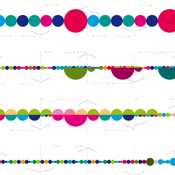
If you’re anything like me, your first reaction on seeing the above was “What is that?” – a question fueled by equal parts wonderment and curiosity.
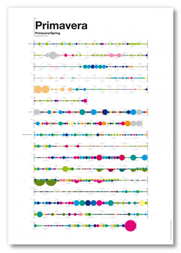
Since my recent post on the idea of a color language, inspired by Hyo Myoung Kim’s Nineteen Eighty-Four, I’ve been seeing color languages all around. These prints, above and below, by graphic designer Laia Clos of Barcelona’s Mot Studio, explore a color-based translation of musical notation. SisTeMu, as the notational schema is called, relies on simple geometric forms and colors to make a piece of music (in this case, the lead violin of Vivaldi’s Four Seasons) tantalizingly visible. How intelligible it might be is another matter, but for the way it dimensionalizes the experience of music, I find it captivating.
Music is one of the most visceral of art forms, capable of evoking intense emotions without a descriptive or narrative thread. It is pure abstraction. Can you imagine opening up a playbill at the philharmonic to find a set of visuals like this inside? It would be so wonderful to try to follow the measures along. I love how the variations in the scale and color of the bubbles create an instantaneous sense of tempo and intensity – it’s a synesthetic experience of sound.
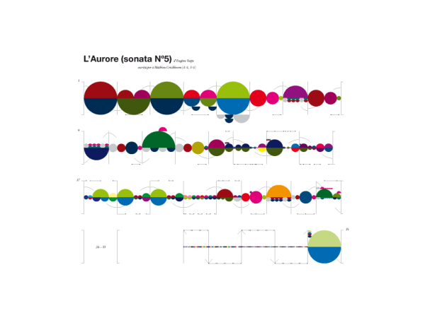
This piece, from Eugene Ysaÿe’s Sonata Nº5 is so wonderfully varied. I think I like the visualization even more than the Vivaldis. Which made me wonder, would I like the music better as well? And, I think I do. Wouldn’t you like to see the below as an animation with the piece?
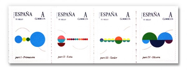
I especially love the stamps for each of the seasons, which are like melodic snapshots. Sonic triggers, in visual form. Both the stamps and the posters are available on Clos’s site, here.
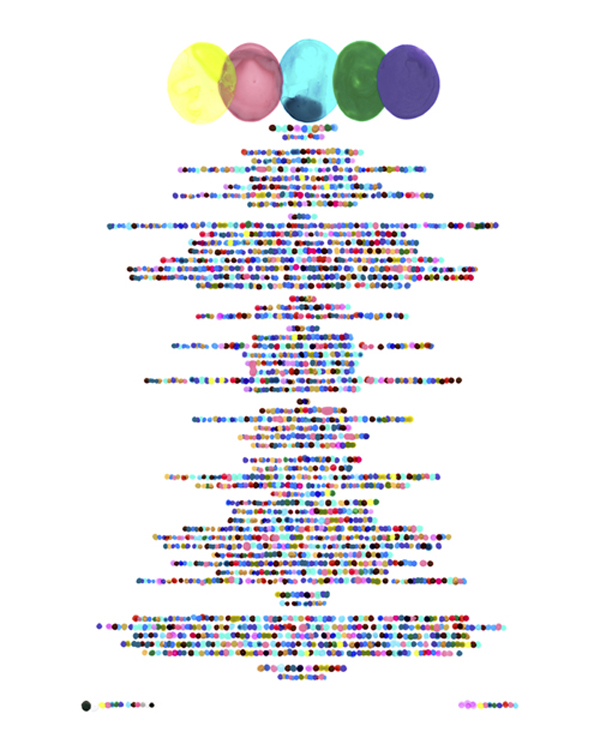
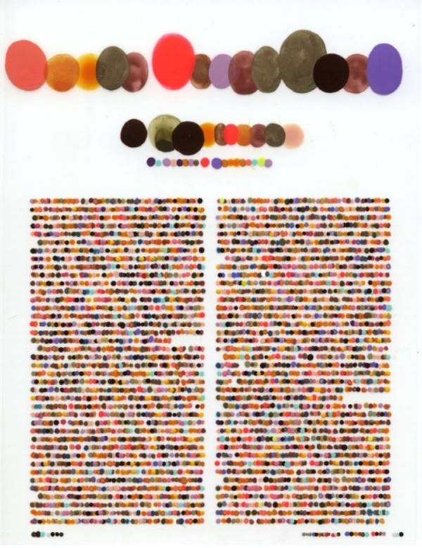
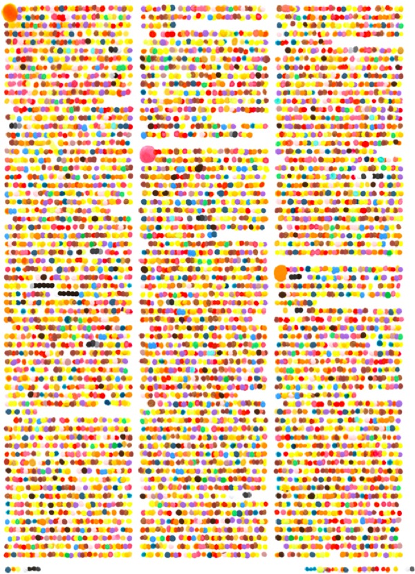
Another color language discovery comes via Anna of the awesome Birds of Ohio blog. She pointed out to me the work of artist Lauren DiCioccio, who, like Hyo Myoung Kim, translates text into color, albeit with a softer, more organic style. These pieces, which DiCioccio calls her color codification dot drawings, take pages from popular magazines such as Vogue and Vanity Fair and reinterpret them in color using a painstaking process with a mylar overlay. She describes them as a kind of “Braille for the color-inclined.” They feel to me almost like an impressionistic language. Poetry, Seurat-style.
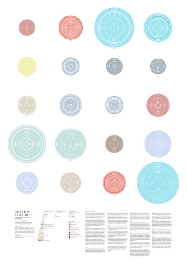
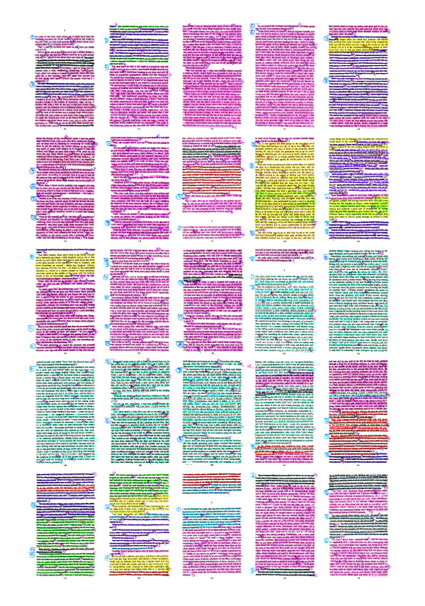
Stephanie Posavec’s Writing Without Words similarly explores reading as an experience that is about more than content. Zooming out – way out – Posavec’s visualizations of books function like a Powers of Ten for literature, giving us a visual image of the structure we sense intuitively as we work our way through a book. This first image shows the chapters of Jack Kerouac’s On The Road, broken into paragraphs and sentences, color-coded by theme. Rhythm Textures, below it, visualizes sentence structures with words as radiating circles, pauses in white. I love how the seeds of all these patterns are visible in the highlighted versions of the manuscripts that Posavec used in constructing these studies.
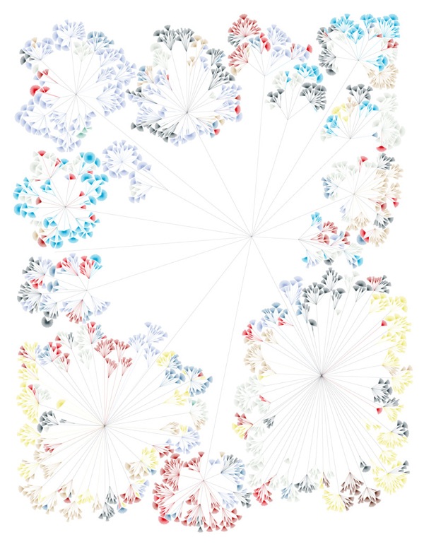
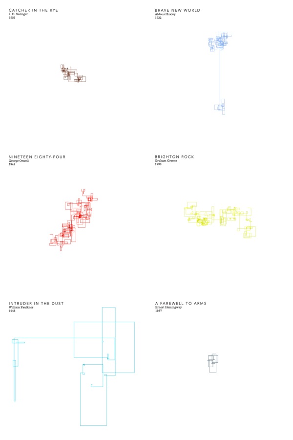
Posavec’s First Chapters, below, is especially fascinating to me. This set of visualizations (only a subset of which is shown below), looks at the first chapters of famous books to illustrate the writing styles of different authors. Line length is based on sentence length, so tighter drawings suggest shorter, crisper style, while looser, more open sketches indicate a more languid style. Could there be a more perfect juxtaposition than Faulkner and Hemingway? Expansive vs. economical, loose loops vs. a tight knot – there’s a real joy in seeing these styles exposed through a system.
Much of the work of both DiCioccio and Posavec seems to concern the visceral and immersive quality of reading and grapples with the fading of this pleasure as so much of our reading now moves onto devices. These color languages, all print projects, manifest the craving for a more emotional, less efficient experience of reading (or listening, as the case may be). After all, a color language is illegible* in terms of content, but emotionally, it is fecund. It simultaneously slows the process down and makes it more immediate, refocusing our attention on the sensorial aspects of narrative, obfuscating content to illuminate meaning.
On the other hand, these projects also make me wonder if the move to devices might hold the possibility of making reading more sensorial, rather than less. True, for me there is no more exquisite literary sensation than the aroma of a good book, whether it’s the musty smell of an aged classic or the pungent, chemical tang of a new one. But imagine being able to see these sentence structures or thematic progressions visualized alongside or overlaid upon your text in an e-book. Reading would be both linear and non-linear, abstract and concrete, intuitive and literal all at once. Through the design of the book, or the e-reading software, we could discover the joy of a completely new and beautiful understanding of the craft of writing.
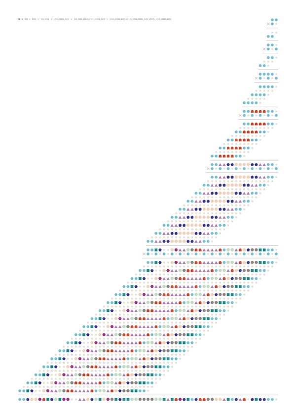
Finally, before I close, I want to highlight just one more color language, also from Posavec. This piece, from her 11x series, looks at mathematics through the lens of form and color. I figured there had to be someone out there translating numbers into color, and though I found Posavec’s work through the meta-narratives above, I was excited to discover these pieces, which visualize her fascination with “long multiplication and other types of handmade calculations” and unlock the “hidden beauty in the cascading lines of digits in this method of multiplying numbers.” Maybe there’s a seed of an idea in here about education, working between the modes of learning – verbal and visual, mathematical and kinesthetic, musical and spatial with translations that make the innate order and beauty of a process legible to the others. Through simple aesthetic delight, perhaps math problems become accessible to the numerically illiterate, or music becomes sensible to the tone-deaf.
{Thank you @issue and Anna for the inspiration for this post.}
*Incidentally, there’s a reason for why a color language would be so much harder to read than standard human languages. Neuroscientist Marc Changizi writes in his book The Vision Revolution that the reason we read so easily is because our letterforms evolved to look like natural objects, (or more correctly, parts of objects) which our brains are primed to process quickly because they surrounded us in our ancestral environment. Reading a text is then very much like reading a landscape. Our letters look like they do because our brain is fast at processing edges and contours, which hold information about an object that could be urgently relevant to our survival, but slower at processing stimuli less urgently relevant to survival. (Is that a cliff edge or a gently sloping hillside? A tiger’s sabre tooth or a ripe apricot? The fastest way to know is shape.) Our letters are not colors because such a detailed level of color identification is not as urgent a mental task; the systems for “reading” color are just naturally slower, (though colors hold lots of intrinsic emotional significance… a topic for another post).



Discussion (4 Comments)
this post is great Ingrid! so much good stuff..
Best,
Anna
This is amazing! Color evokes so much emotion and it’s so easy for people to glean patterns – thanks for compiling all of this awesomeness.
This is really great. Research and color combined is winning
Ingrid,
I found it interesting that in the last example I was able to understand the first couple of multiplications quickly, before I had noticed the guide in small type to the left. As the calculations became longer I lost interest in translating the numerals but became more interested in the shape patterns that developed as well as the palpable relief I felt when I saw that warm colors became part of the “equation”.
So (at least) 3 layers possible by playing with color as well as form: the actual information being conveyed; the patterns coincidental to that information; and how the information has been mapped to color and our emotional connection. And this happened quite spontaneously, in my fascination of discovery I had forgotten that this is what your post was about!
Thanks for this.